Rebranding: Think Different
Remember! To stand still is to go backwards. Think of athletes constantly training to improve their times so that they don’t get overtaken by their competitors, who are training equally hard! Never rest on your laurels! You risk being overtaken!
The great brands know this! Their history shows that they are committed to moving forwards – to constantly reposition themselves in the changing world around them.
How do they achieve this?
The subtle and seamless change of the Starbucks 2011 rebrand is a perfect example of this. Superfluous information and design was stripped away but the core of the image – the iconic green and the siren iconography was kept. The essence of the brand image.

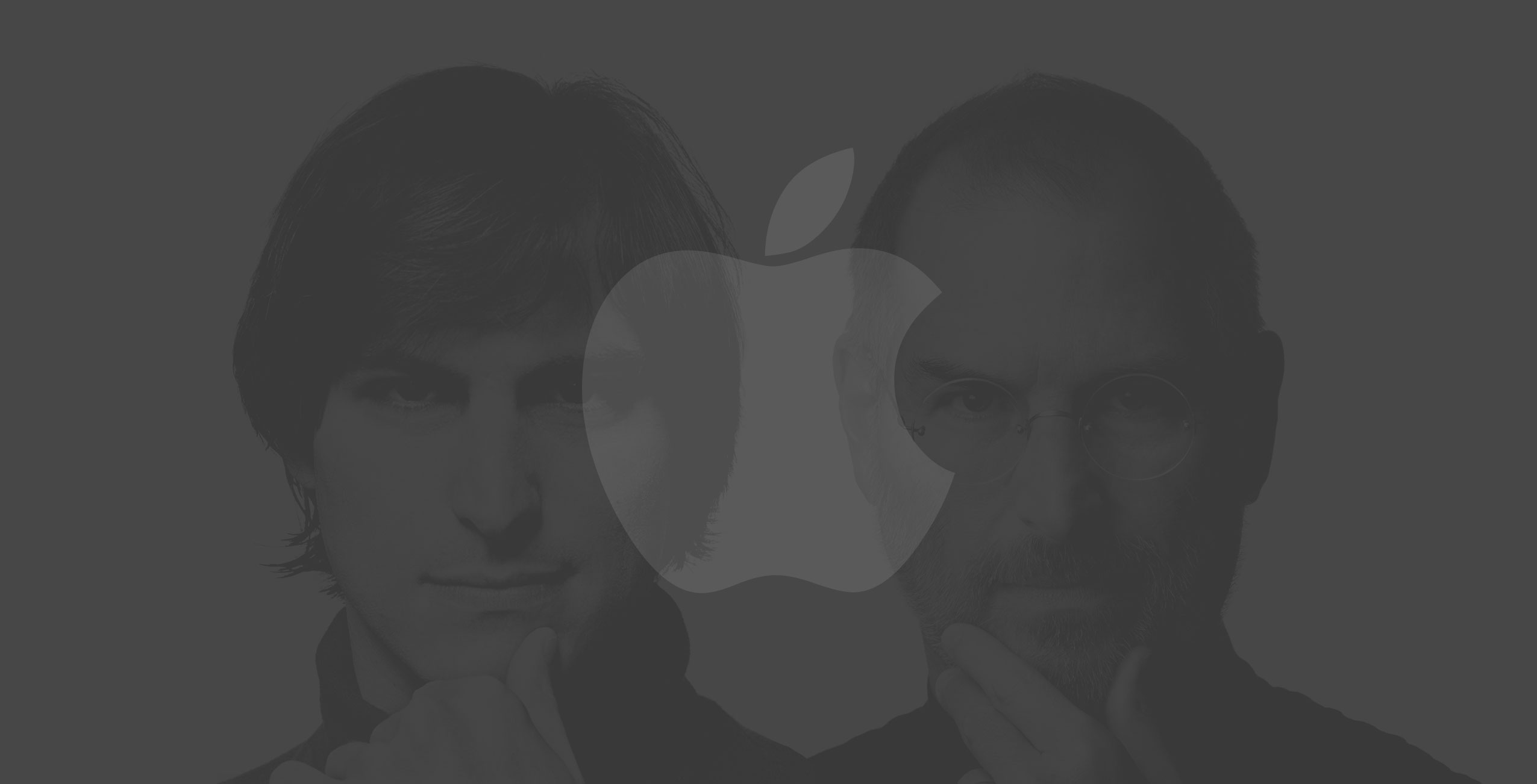
Finding the core does not apply to imagery alone. Although recently Apple became the first $1 trillion company on the stock market, in 1997 Apple came close to bankruptcy. It was seen as inferior to its competitors such as IBM, Dell and HP.
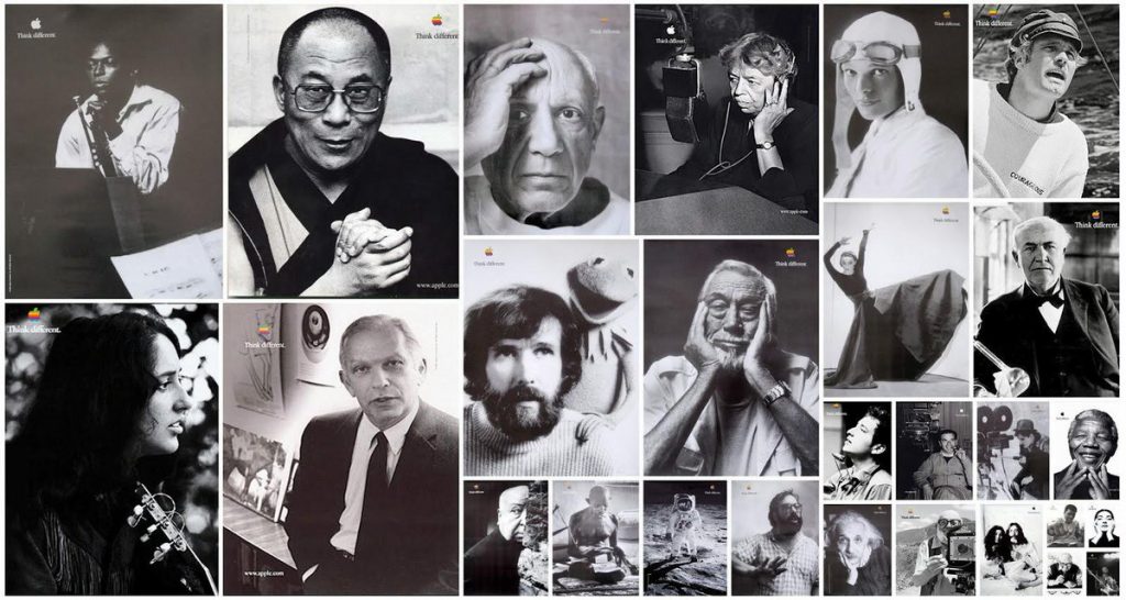
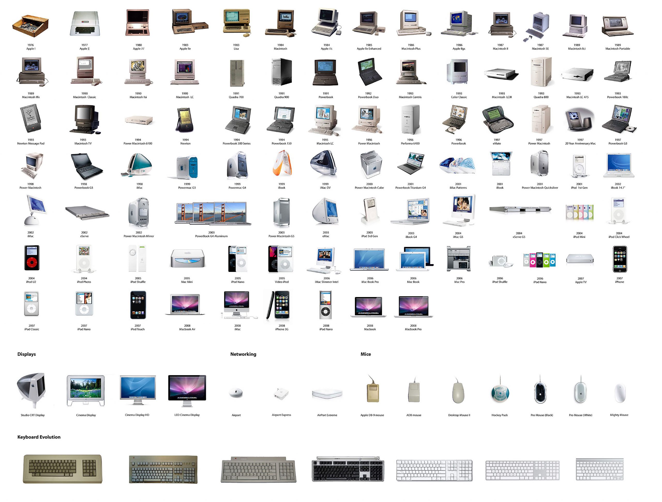
As soon as Steve Jobs took charge of the company in 1997 (after having been fired in 1985), he began looking for the core, the essence of the company and the focus of his attention was not on what to add but on what to take away! Seventy percent of the product line was stripped away so that the company could concentrate on producing the best of the best and he highlighted the core value of the company – the belief that ‘people with passion can change the world’. So began one of the most iconic campaigns in marketing history – the Think Different campaign.

Everything was simplified – much like Nike had done – and with campaigns such as Just Do It, Apple changed its emphasis away from showing people what they produced to telling people what they believed – and they asked their customers to believe too!
The subsequent success of the company showed in their increased sales, as people began buying Apple, not so much for the products they made but for the values that they represented.
Up until 2002 the company had still been called Apple Computers but from this point it was to be known simply as Apple. This further refinement stripped the company name down to its very core.

Cutting down did not limit the company – it built it up and was a way to broaden its horizons, providing the freedom to branch out into the music, phone and watch industries, industries whose very nature was to be changed by the growth and success of Apple.
A simple – arguably minor and almost unnoticed – change in the company’s name, made Apple the hugely successful enterprise that it is today.
Finding the core is the most important part of a successful rebrand. Just Do It!


Great companies ‘Just Do It’
Learning why and how it’s done, from the biggest brands in the world.
Life is like going the wrong way on a moving sidewalk. Walk and you stay put. Stand still and you go backwards. To get ahead you have to hustle.”
All successful businesses know that to stand still is to stay put! If you look at the journey of any great brand it is easy to see how it has constantly moved forward, constantly being repositioned within a fast-moving world. I will look at some of the most significant rebrands to see what lessons can be learned by smaller brands.
In this two part blog we look at some of the biggest rebrands in history — and the lessons that smaller brands can learn.
Spread your wings
In 1971 Blue Ribbon Sports – which had been a distributor of Japanese Tiger running shoes since 1964 – decided to launch its own brand of footwear. Originally selling shoes from the backs of cars, the company had already grown to have their own outlet in California together with another branch on the East Coast. The desire was to become a global brand and from this point all products designed and distributed by this company was to display a logo which would become instantly recognizable – the swoosh of the Nike brand!
Their founder, Phil Knight, said:
“Ultimately, we wanted Nike to be the world’s best sports and fitness company. Once you say that, you have a focus. You don’t end up making wing tips or sponsoring the next Rolling Stones world tour.”
In America, the blue ribbon is awarded to first prize in athletics and in county fairs, to children and dogs. In Ancient Greek mythology, Nike is the Goddess of Victory — the very personification of victory. The core message remains the same — being the best, number one — but the image becomes universally recognisable. The name Nike and the image of the swoosh are not constricted by borders or language barriers. They represent the origins and the core message of the company, but now they also represent the goals and ambitions of the company to “become the world’s best.”
Whilst it is true that everyone’s ambitions are not quite as grand, the basic idea is the same – maintaining a forward momentum. After understanding the essence of your brand and the things you do not want to change, it is possible to make decisions on the directions you wish to take. Identify your ambitions and goal; create a space into which you want to move and grow into that space.
Next time we look at Apple, Starbucks and Old Spice — and how they overcame common rebranding obstacles.

