Remember!To stand still is to go backwards. Think of athletes constantly training to improve their times so that they don’t get overtaken by their competitors, who are training equally hard! Never rest on your laurels!You risk being overtaken!
The great brands know this!Their history shows that they are committed to moving forwards – to constantly reposition themselves in the changing world around them.
How do they achieve this?
The subtle and seamless change of the Starbucks 2011 rebrand is a perfect example of this.Superfluous information and design was stripped away but the core of the image – the iconic green and the siren iconography was kept.The essence of the brand image.
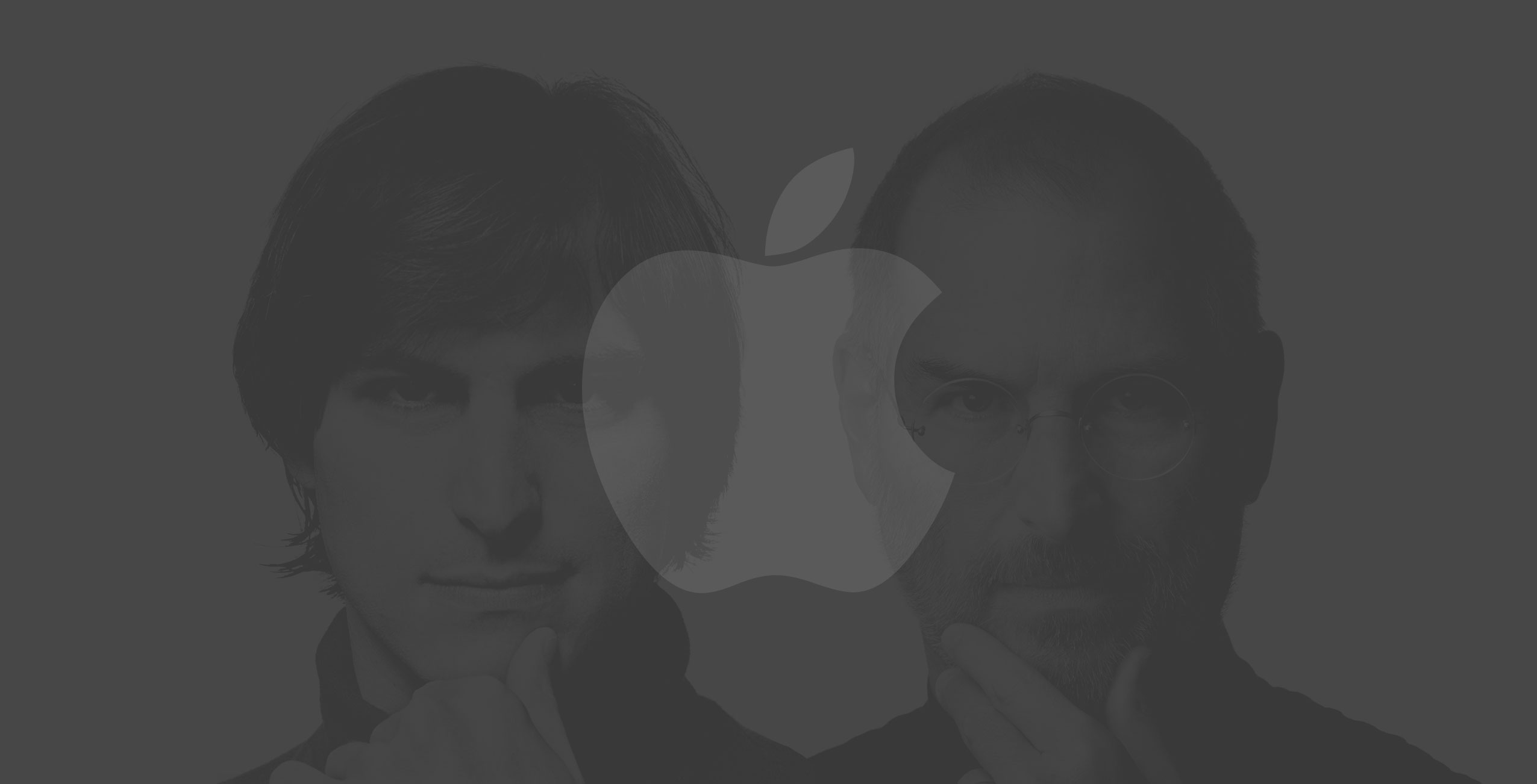
Finding the core does not apply to imagery alone. Although recently Apple became the first $1 trillion company on the stock market, in 1997 Apple came close to bankruptcy. It was seen as inferior to its competitors such as IBM, Dell and HP.
As soon as Steve Jobs took charge of the company in 1997 (after having been fired in 1985), he began looking for the core, the essence of the company and the focus of his attention was not on what to add but on what to take away! Seventy percent of the product line was stripped away so that the company could concentrate on producing the best of the best and he highlighted the core value of the company – the belief that ‘people with passion can change the world’. So began one of the most iconic campaigns in marketing history – the Think Different campaign.
Everything was simplified – much like Nike had done – and with campaigns such as Just Do It, Apple changed its emphasis away from showing people what they produced to telling people what they believed – and they asked their customers to believe too!
The subsequent success of the company showed in their increased sales, as people began buying Apple, not so much for the products they made but for the values that they represented.
Up until 2002 the company had still been called Apple Computers but from this point it was to be known simply as Apple. This further refinement stripped the company name down to its very core.
Cutting down did not limit the company – it built it up and was a way to broaden its horizons, providing the freedom to branch out into the music, phone and watch industries, industries whose very nature was to be changed by the growth and success of Apple.
A simple – arguably minor and almost unnoticed – change in the company’s name, made Apple the hugely successful enterprise that it is today.
Finding the core is the most important part of a successful rebrand. Just Do It!
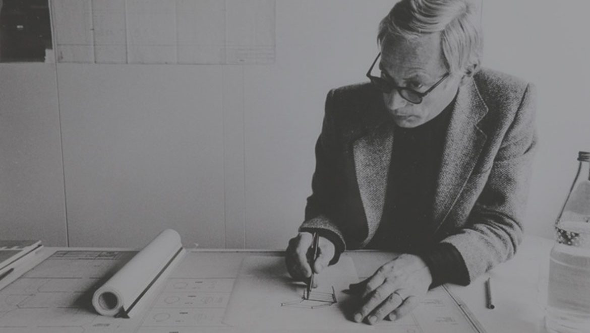
Rams began studies in architecture and interior decoration at Wiesbaden School of Art in 1947. Soon after in 1948, he took a break from studying to gain practical experience and conclude his carpentry apprenticeship.
He resumed studies at Wiesbaden School of Art in 1948 and graduated with honours in 1953 after which he began working for Frankfurt based architect Otto Apel. In 1955, he was recruited to Braun as an architect and an interior designer. In addition, in 1961, he became the Chief Design Officer at Braun until 1995.
Rams introduced the idea of sustainable development and of obsolescence being a crime in design in the 1970s.
Accordingly he asked himself the question…
Is my design good design? The answer formed his now celebrated ten principles.
Good design
Is innovative – The possibilities for progression are not, by any means, exhausted. Technological development is always offering new opportunities for original designs. But imaginative design always develops in tandem with improving technology, and can never be an end in itself.
Makes a product useful – A product is bought to be used. It has to satisfy not only functional, but also psychological and aesthetic criteria. Good design emphasizes the usefulness of a product whilst disregarding anything that could detract from it.
Is aesthetic – The aesthetic quality of a product is integral to its usefulness because products are used every day and have an effect on people and their well-being. Only well-executed objects can be beautiful.
Makes a product understandable – It clarifies the product’s structure. Better still, it can make the product clearly express its function by making use of the user’s intuition. At best, it is self-explanatory.
Is unobtrusive – Products fulfilling a purpose are like tools. They are neither decorative objects nor works of art. Their design should therefore be both neutral and restrained, to leave room for the user’s self-expression.
Is honest – It does not make a product appear more innovative, powerful or valuable than it really is. It does not attempt to manipulate the consumer with promises that cannot be kept.
Is long-lasting – It avoids being fashionable and therefore never appears antiquated. Unlike fashionable design, it lasts many years – even in today’s throwaway society.
Is thorough down to the last detail – Nothing must be arbitrary or left to chance. Care and accuracy in the design process show respect towards the consumer.
Is environmentally friendly – Design makes an important contribution to the preservation of the environment. It conserves resources and minimizes physical and visual pollution throughout the lifecycle of the product.
Is as little design as possible – Less, but better – because it concentrates on the essential aspects, and the products are not burdened with non-essentials. Back to purity, back to simplicity.
“Surfaces that were without apology, bold, pure, perfectly-proportioned, coherent and effortless.”